Asa

Asa

Built on

Built on

Built on

Services

Website Design / Development

Year

2022

Website

asabeauty.com

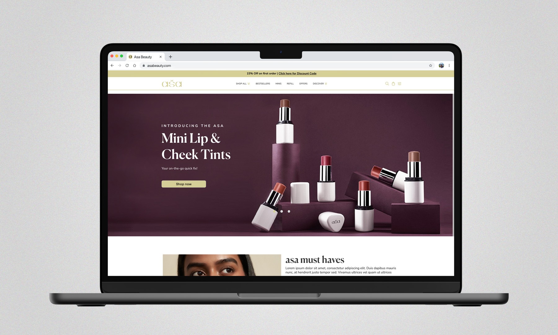
Asa Beauty approached us with a clear challenge their existing experience wasn’t keeping up with how modern users shop. They needed a clean, mobile-first eCommerce website that didn’t just look premium, but actually made it easier for users to discover, understand, and buy products. The focus wasn’t just redesign it was improving conversion across every touchpoint.

Project Goal

Project Goal

Once we understood the brief, the direction became clear. This wasn’t about adding more design it was about removing friction. We focused on: Simplifying navigation, Making product discovery faster, Reducing decision fatigue and guiding users smoothly from landing → product → checkout


In eCommerce, even a 1–2 second delay or extra step can drop conversions by 10–20%.

We started with mobile, not desktop.

We started with mobile, not desktop.

In India, over 75–85% of eCommerce traffic comes from mobile devices, especially in beauty and personal care categories. But most websites are still designed desktop-first and adapted later which creates friction.


So instead, we:Designed layouts specifically for thumb-friendly navigation, Prioritised fast loading and lightweight assets, Structured content for quick scanning, Reduced unnecessary interactions


The result? A smoother, faster experience that feels natural on mobile not forced.

In India, over 75–85% of eCommerce traffic comes from mobile devices, especially in beauty and personal care categories. But most websites are still designed desktop-first and adapted later which creates friction.


So instead, we:Designed layouts specifically for thumb-friendly navigation, Prioritised fast loading and lightweight assets, Structured content for quick scanning, Reduced unnecessary interactions


The result? A smoother, faster experience that feels natural on mobile not forced.

Every page was treated like a conversion point.

Every page was treated like a conversion point.

We mapped user intent at each stage:


Homepage → discovery

Collection pages → comparison

Product pages → decision making


That meant: Clear visual hierarchy, Strong CTAs without being aggressive, Strategic spacing to reduce overwhelm, Content placed where users actually look


Good design doesn’t shout but rather it guides.

We mapped user intent at each stage:


Homepage → discovery

Collection pages → comparison

Product pages → decision making


That meant: Clear visual hierarchy, Strong CTAs without being aggressive, Strategic spacing to reduce overwhelm, Content placed where users actually look


Good design doesn’t shout but rather it guides.

While mobile was the priority, the experience was built to scale seamlessly across devices.

While mobile was the priority, the experience was built to scale seamlessly across devices.

Each layout was carefully adapted for: Mobile, Tablet, Desktop


Not just resized, but rethought. This ensures users get a consistent, high-quality experience no matter how they land on the site, which is critical for trust and retention.

Each layout was carefully adapted for: Mobile, Tablet, Desktop


Not just resized, but rethought. This ensures users get a consistent, high-quality experience no matter how they land on the site, which is critical for trust and retention.

The product page is where decisions happen.

The product page is where decisions happen.

Instead of a standard layout, we built a custom PDP focused on reducing hesitation and building trust.


Key improvements included:

Integrated product videos to showcase real usage

Clear, structured product information

Visual hierarchy that highlights key benefits first

Faster add-to-cart interaction


Adding video alone can increase conversion rates by up to 80% in beauty eCommerce, especially for first-time buyers.


The goal was simple: Answer every question before the user even thinks of leaving.

Instead of a standard layout, we built a custom PDP focused on reducing hesitation and building trust.


Key improvements included:

Integrated product videos to showcase real usage

Clear, structured product information

Visual hierarchy that highlights key benefits first

Faster add-to-cart interaction


Adding video alone can increase conversion rates by up to 80% in beauty eCommerce, especially for first-time buyers.


The goal was simple: Answer every question before the user even thinks of leaving.

Result

Result

The final outcome is a website that doesn’t just represent the brand better it performs better. A faster, cleaner, and more intuitive experience that aligns with how users actually shop today.

The final outcome is a website that doesn’t just represent the brand better it performs better. A faster, cleaner, and more intuitive experience that aligns with how users actually shop today.

Back to top

Back to top

Let's create
something
extraordinary
together.

Let’s make an impact

Avatar of the website author

Tabrez Pathan

Director

Hit us up if you’re looking for a fast, reliable web-designer who can bring your vision to life

Copyright © WildWildWeb, 2026

Back to top

Back to top

Let's create
something
extraordinary
together.

Let’s make an impact

Avatar of the website author

Tabrez Pathan

Director

Hit us up if you’re looking for a fast, reliable web-designer who can bring your vision to life

Copyright © WildWildWeb, 2026

Back to top

Back to top

Let's create
something
extraordinary
together.

Let’s make an impact

Avatar of the website author

Tabrez Pathan

Director

Hit us up if you’re looking for a fast, reliable web-designer who can bring your vision to life

Copyright © WildWildWeb, 2026